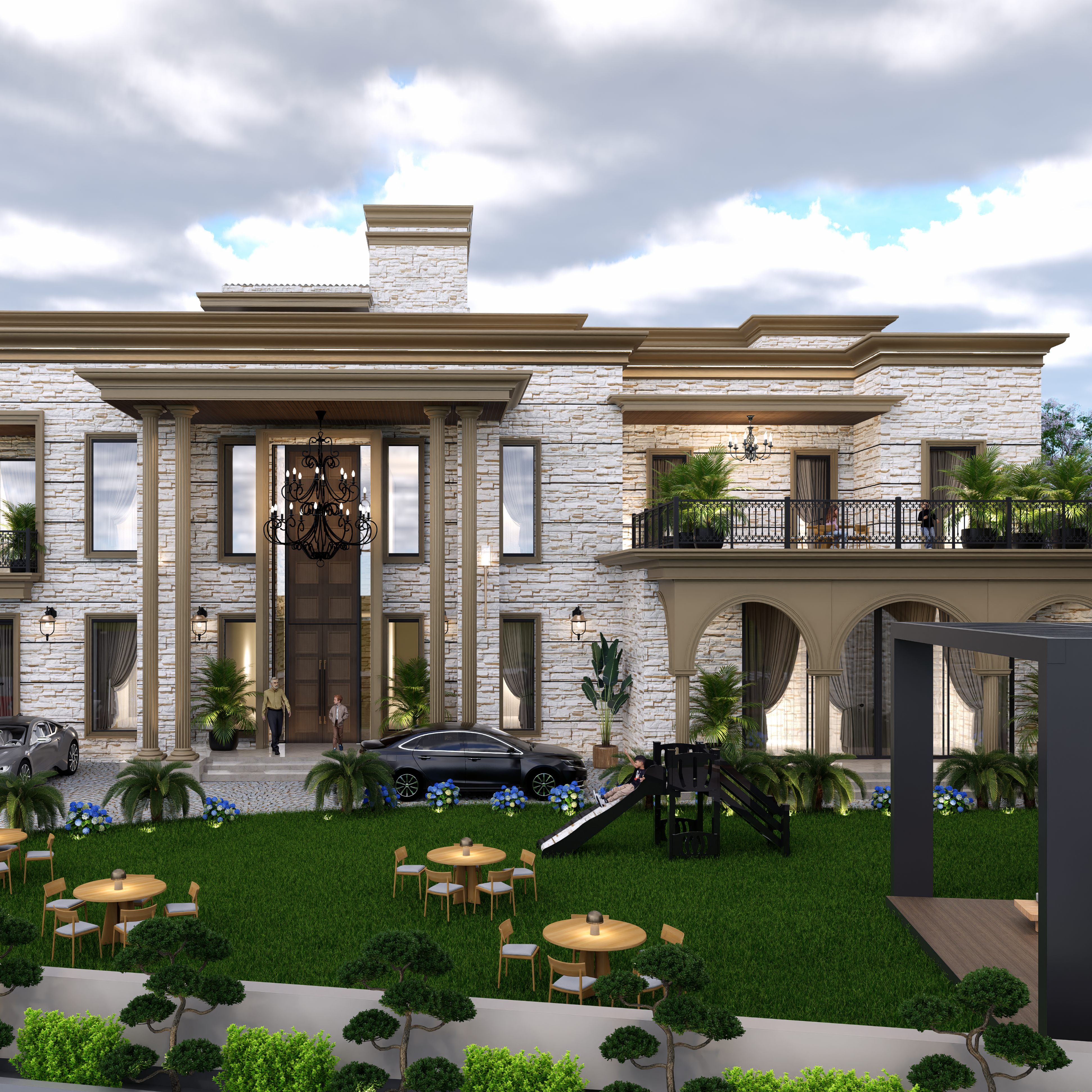
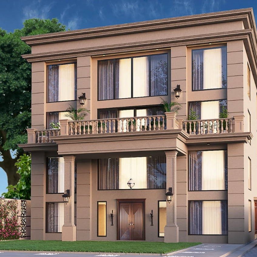
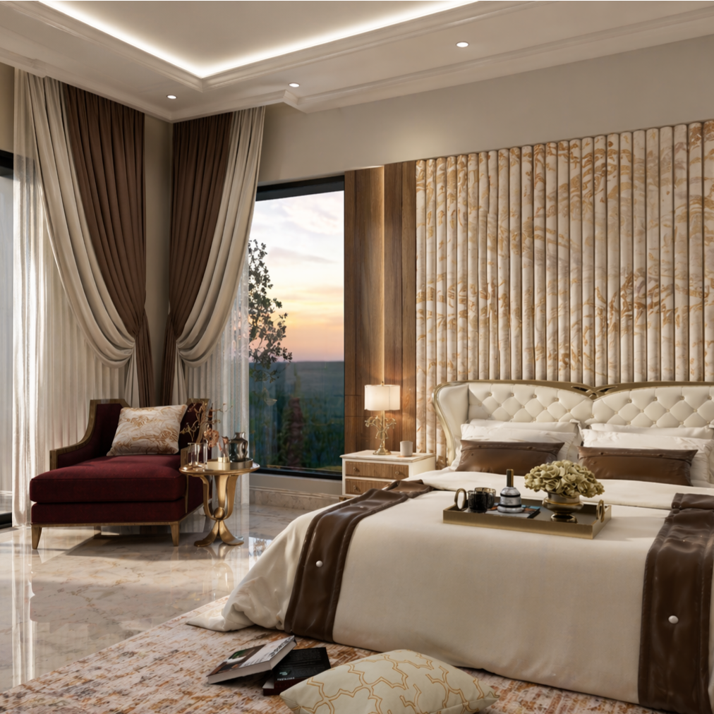
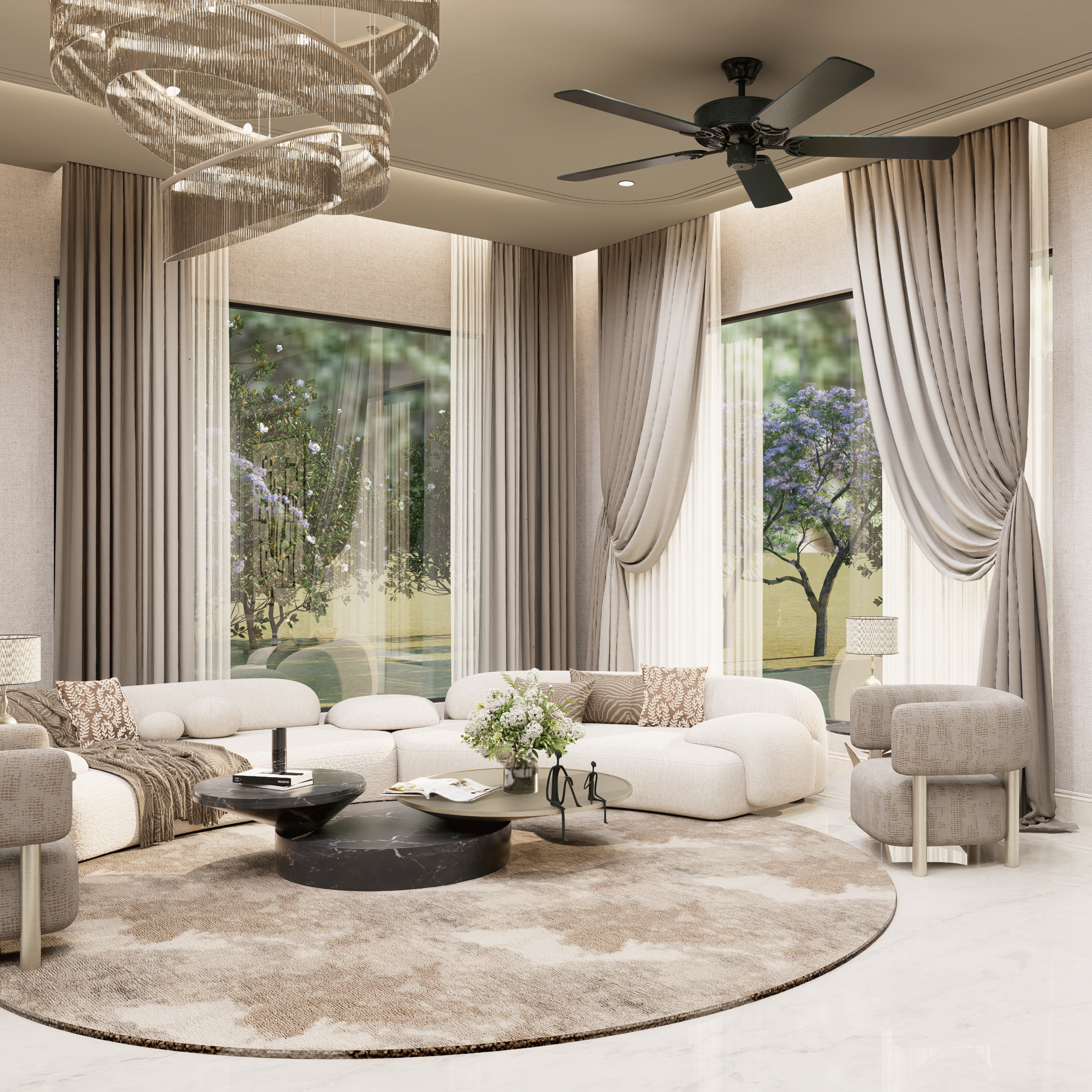
3D Print of WoodArchitecture of the Future

Imagine stepping into a space that feels warm, textured, and deeply natural like wood has always made us feel. Now imagine that not a single tree was cut in its traditional form to create it. The walls, the panels, even the furniture around you have been printed layer by layer with a material that looks and behaves like wood. It sounds futuristic, but this idea is slowly shaping the next chapter of architecture. 3D printing with wood is not about replacing what we already love. It is about evolving how we use it. For years, wood has been one of the most trusted materials in architecture because of its warmth and versatility. But traditional processes often come with limitations. There is waste, there are design constraints, and there is always a balance between creativity and practicality. This is where 3D printing changes the conversation. Instead of cutting and assembling, designers can now grow forms digitally and bring them to life through printing. Curves, textures, and patterns that once required intense craftsmanship can now be achieved with precision and consistency. Think about a wall that flows like a natural surface or a partition that filters light in a way that feels almost alive. These are not just design elements. They are experiences. Now take a moment and picture your own space. What if your bedroom wall was designed specifically for how sunlight enters your room in the morning. What if your furniture was not selected from a catalog but created to match your lifestyle exactly. 3D printed wood opens doors to personalization at a level we have not seen before. Spaces begin to feel less generic and more like an extension of who we are. The material itself is equally fascinating. Most 3D printed wood is made from a blend of recycled wood fibers and biodegradable binders. This means that what was once considered waste can now become part of a new structure. It shifts the idea of sustainability from being an add on feature to becoming a core design principle. Instead of asking how to reduce harm, architects can start asking how to create responsibly from the beginning. At the same time, it is important to stay grounded. This technology is still evolving. Questions around strength, long term durability, and large scale construction are being explored. Costs can also be a barrier, especially for widespread adoption. But every major shift in architecture has started this way. Experimental at first, then gradually becoming more accessible and refined. What truly makes 3D printed wood exciting is the creative freedom it brings. Architecture begins to move closer to nature not just in material, but in form. Structures can mimic growth patterns, interiors can feel more fluid, and design can break away from rigid geometry. It creates a bridge between technology and nature, where both work together rather than against each other. As designers and creators, this opens up a new mindset. It is no longer just about building spaces. It is about shaping experiences that feel intentional, sustainable, and deeply human. And for anyone experiencing these spaces, it changes the way we connect with our surroundings. So the next time you run your hand across a wooden surface, pause for a second. Think about its journey. Was it carved in the traditional way, or was it printed with precision and purpose. In the future, that line may blur completely, and what we call wood might be something far more innovative than we ever imagined.

Maximising Small Spaces with Color Play

Small spaces get a bad reputation. “Too cramped,” “too limiting,” “hard to style.” But here’s the twist some of the most beautiful, personality filled homes exist in the smallest corners. The difference? They have mastered the art of color play. Color is not just decoration. In a compact space, it is architecture. It shapes how big or small your room feels, where your eye travels, and how comfortable you are in it. Let’s start with the obvious but do it right. Light shades like warm whites, soft greys, and muted pastels are your foundation. They reflect light, reduce visual clutter, and instantly make walls feel more open. But if you stop here, your space might end up looking safe. And honestly, a little forgettable. Now comes the interesting part, contrast with intention. Add one bold element that creates depth. A rich emerald green wall behind your bed, a burnt orange reading nook, or even a deep navy wardrobe. This contrast tricks the eye into seeing layers, making the room feel more expansive than it actually is. Here’s a quick visual exerciseStand at your doorway and look into your room. Where does your eye land first? That’s your focal point. Now imagine enhancing it with a contrasting color. Suddenly, the space feels designed, not just filled. Another underrated trick? Vertical color play. Painting the lower half of your walls in a slightly darker shade and keeping the upper half light draws the gaze upward. The result? Your ceiling feels higher, and your room feels taller. Perfect for those compact city apartments. And do not sleep on color zoning. In small spaces, especially studio setups, you can define areas without adding physical barriers. A soft blush tone for your sleeping area, a muted sage for your work corner no walls needed, but the separation feels real. Furniture plays its part too. Instead of blending everything in, let one or two pieces stand out. A mustard chair, a teal cabinet, or even colorful cushions can act as visual anchors. Think of your room like an outfit. If everything matches, nothing stands out. But one bold accessory? Game changer. Lighting also interacts with color more than people realize. Natural light enhances softer tones and keeps bold colors from feeling heavy. If your room lacks sunlight, go for warmer shades instead of stark whites. They keep the space cozy rather than clinical. Now let’s make it personal. What’s a color that instantly lifts your mood? Maybe it is the soft yellow of early morning sunlight, the calming green of plants, or a deep blue that feels like peace after a long day. That color deserves a place in your space no matter how small it is. Because here is the truth a room does not feel bigger just because it looks bigger. It feels bigger when it feels right. Before you leave, try this mini challengeLook around your space right now. If you could change just one thing a wall color, a cushion, a curtain what would it be? Start there. Sometimes, one thoughtful color choice is all it takes to transform everything.

Balanced Luxury and Design: A Quiet Expression of Elegance

Luxury today feels different-it’s less about showing off and moreabout how a space makes you feel. Balanced luxury is aboutcreating environments that feel refined yet effortless, wherenothing is too much and nothing feels missing. It’s the kind ofdesign that doesn’t try too hard, but still leaves a lastingimpression. Through intentional design, every element has arole, bringing together comfort, beauty, and purpose in a way thatfeels natural and lived-in. This approach comes alive through thoughtful choices rather thanexcessive ones. High-quality finishes, calming tones, andcarefully selected pieces create a space that feels both elevatedand welcoming. Instead of filling every corner, minimal yetimpactful design allows the space to breathe-letting textures,materials, and details quietly stand out. It’s not about perfection,but about creating a sense of ease where everything feels just rightfor the people living in it. As design continues to evolve, modern luxury interiors arebecoming more personal and grounded. The idea of luxury indesign now leans toward simplicity with depth-spaces that reflectindividuality while maintaining a sense of harmony. It’s aboutcreating an experience that feels calm, warm, and timeless. In thisbalance, luxury isn’t loud-it’s subtle, thoughtful, and deeplyconnected to the way we live.

AI and Computational Design: The Future of Smart Creativity

AI and computational design are quietly transforming the way we imagine and create spaces, products, and experiences and the best part is, you don’t need to be a tech expert to understand how exciting this shift is. Think of it like this instead of designing everything manually, designers now collaborate with smart systems that can analyze data, suggest ideas, and even generate multiple design options in seconds. Sounds futuristic, right? But it’s already happening. At its core, AI in design uses machine learning and data to understand patterns like what kind of layouts people prefer, how light interacts with a room, or which materials perform best. On the other hand, computational design is more about using algorithms and rules to create designs. When these two come together, they unlock a whole new level of creativity. Designers are no longer limited by time or manual effort they can explore hundreds of possibilities quickly and choose what works best. Imagine you’re designing a luxury apartment. Instead of guessing the perfect layout, AI tools can suggest optimized floor plans based on space usage, natural lighting, and even user behavior. This not only saves time but also improves efficiency and accuracy. That’s why keywords like AI powered design, generative design, smart architecture, and parametric design are becoming so popular in the industry. What makes this even more interesting is how interactive the process becomes. Designers can tweak a few inputs like size, budget, or style and instantly see new design variations. It’s almost like having a creative partner who never runs out of ideas. And don’t worry, AI isn’t replacing designers it’s enhancing their creativity and helping them make smarter decisions. As technology continues to evolve, AI and computational design will play a bigger role in shaping modern interiors, architecture, and product design. So next time you see a perfectly designed space, there’s a good chance that behind its beauty, there’s a blend of human creativity and intelligent technology working together. Pretty cool, right?

Adaptive Reuse: Giving Spaces a Second Life

What it really means Adaptive reuse is less about redesigning and more about reimagining. Instead of starting from scratch, it’s about taking an existing space and transforming it while still holding onto parts of its original character. The idea is simple don’t erase the past, just make it work beautifully in the present. Why it feels different There’s something about reused spaces that just feels more real. Maybe it’s the textures, the little imperfections, or the sense that the space has evolved over time. In a world full of similar-looking interiors, adaptive reuse brings in a kind of depth and personality that new spaces often miss. Where it works best In luxury apartments, this approach adds a quiet richness. Whether it’s upgrading older homes in prime locations or blending restored elements into modern interiors, it creates spaces that feel curated rather than constructed. It’s especially meaningful for clients who want a fresh look without letting go of what already exists. The real value At its core, adaptive reuse is about balance between old and new, memory and modern living. And that’s what makes it stand out. Because a space that carries a story doesn’t just look good… it feels right.

Adaptive Use of Heritage Structures

Have you ever walked past an old building and wondered about the stories it holds? The faded walls, the intricate details, the quiet charm it all feels like a piece of history frozen in time. Now imagine that same space brought back to life, not by erasing its past, but by reimagining its future. That’s the beauty of adaptive reuse. Instead of demolishing heritage structures, adaptive reuse is about transforming them into functional, modern spaces while preserving their original character. Think of an old haveli turned into a boutique café, or a colonial building redesigned into a co-working space. The structure remains, but the experience evolves. And honestly, doesn’t that feel more meaningful than starting from scratch? There’s something incredibly powerful about spaces that carry history and purpose at the same time. You’re not just walking into a café you’re stepping into a story. The aged textures, the vintage doors, the high ceilings they add a depth that modern construction often struggles to replicate. But here’s something to think about: why are more people and brands leaning towards this approach today? Part of it is sustainability. Reusing existing structures reduces construction waste and preserves resources. But beyond that, it’s also about identity. In a world full of similar-looking spaces, heritage buildings offer uniqueness that can’t be copied. From a design perspective, adaptive reuse is where creativity truly shines. It’s about finding a balance what do you preserve, and what do you modernize? How do you introduce new functionality without losing the soul of the structure? It’s not just design; it’s storytelling through space. And if you’re someone working with brands or spaces, this idea opens up so many possibilities. Imagine creating a gym, café, or lifestyle space inside a heritage structure instantly, it stands out. It becomes a destination, not just a place. You don’t need to own a heritage property to appreciate this concept. The next time you visit a thoughtfully restored space, pause for a second. Notice the details. The contrast. The feeling. Because adaptive reuse isn’t just about architecture it’s about respecting the past while designing for the future. So here’s a question for you: if you could transform one old space into something new, what would you create?

Ancestral Structures & Architecture That Lasts for Years

Have you ever stood in front of an old haveli, a centuries-old temple, or even your grandparents’ home… and wondered, how is this still standing so strong? There’s something special about ancestral structures. They don’t just survive time—they age with grace. And honestly, modern buildings? They often don’t come close. So what’s the secret? Let’s talk about it. It Was Never Just About Building—It Was About Understanding Back then, architecture wasn’t rushed. It wasn’t about finishing a project quickly or cutting costs. It was about: Homes were built with thick walls to keep heat out, inner courtyards for natural light and airflow, and materials like stone, lime, and wood that actually breathe. Today, we call it “sustainable design.” Back then? It was just common sense. Built to Last… Not to Replace Most modern constructions are designed with a lifespan in mind—20, 30, maybe 50 years. But ancestral structures? They were built for generations. Think about it: Instead of deteriorating quickly, these structures develop character. The cracks, the textures, the faded colors—they tell stories. And that’s something no modern polish can replicate. There Was Emotion in Every Corner This is something we often overlook. Ancestral homes weren’t just “projects.” They were personal. Every space had meaning: These spaces were designed for living, not just for looking good on Instagram. What Modern Architecture Can Learn Now, this doesn’t mean modern design is bad. But it can learn a lot. Imagine combining: With: That’s where magic happens. Because Good Architecture Isn’t Temporary At the end of the day, trends will change. Minimal today, maximal tomorrow.Concrete today, something else next year. But architecture that lasts?It goes beyond trends. It feels rooted. It feels timeless. A Thought to Take With You Next time you walk past an old structure, don’t just see it as “outdated.” Look closer. You might just find: Because sometimes, the future of architecture… is hidden in the past.

The Art of Trying in Design

Experiments in design aren’t about randomly trying things and hoping something sticks, they’re about curiosity meeting intention in the most human way possible—think of it like this: every time you shift a color palette, play with lighting, mix materials, or even break a “rule” you’ve always followed, you’re actually asking a quiet question, “what if this feels better?” and that’s where real design begins. Whether you’re styling your own space or working on a client project, experimentation gives you permission to move beyond safe choices and discover something that feels uniquely yours, because honestly, the most memorable spaces are never the ones that played it safe. Maybe it’s pairing a modern sofa with a vintage lamp, or using a bold texture where everyone expects something minimal, or even choosing an unconventional layout that just flows better for your lifestyle—these are all small experiments that slowly build a design story that reflects you. And the thing is, not every experiment will “work” in the traditional sense, but even that teaches you something valuable about balance, proportion, and personal taste, which is way more important than blindly following trends. In fact, trends come and go, but spaces built through experimentation tend to feel timeless because they carry a sense of personality and lived experience. If you think about it, design experiments are a lot like trying new things in life—you don’t always get it perfect on the first go, but each attempt gets you closer to something that feels right. So instead of asking “will this look good?” maybe start asking “does this feel like me?” because that shift in mindset changes everything. When you allow yourself to experiment, design stops being a task and starts becoming a process of exploration, where every choice is a step toward creating something that doesn’t just look beautiful, but feels deeply personal and meaningful, and that’s where the magic really happens.

The Psychology of Colors

Ever walked into a room and instantly felt calm, fresh, or even slightly uncomfortable without really knowing the reason? That feeling usually comes from the colors around you. Colors have a strong effect on how we think, feel, and even behave, which is why they play such an important role in interior design. The shades you choose for your home are not just about making the space look good—they quietly reflect your personality and influence your everyday mood. For example, if your home is filled with soft neutrals like beige, cream, or light grey, it often shows that you prefer a simple, peaceful, and well-balanced environment where your mind can relax. If you lean towards deeper tones like blues or greens, it usually reflects a need for calmness, focus, and a connection to comfort. On the other hand, if you enjoy brighter colors like yellow, orange, or even hints of red, it often means you like energy, warmth, and a lively atmosphere where people can gather and interact. Even an all-white or pastel space, which may look very minimal, often shows a preference for clarity, openness, and a fresh, clutter-free lifestyle. But here’s something to pause and think about—are you choosing colors that truly feel right to you, or are you picking what you’ve seen trending online? Because a home should never feel like a copy of something else. It should feel natural, like it belongs to you. The right colors can change your entire experience of a space, from how relaxed you feel after a long day to how productive you are during work hours. So the next time you are selecting colors for your home, take a moment and ask yourself a simple question—what do I want to feel when I walk into this room? Because in the end, your home is not just about walls, furniture, and decor, it is about emotions, and colors are what bring those emotions to life in the most subtle and powerful way.

Where Curves Create Calm

Curves and soft forms have this almost magical ability to transform a space—not loudly, but in a way you feel before you even realize it. Have you ever walked into a room and instantly felt more relaxed, without knowing why? Chances are, it wasn’t just the colors or lighting, but the absence of harsh edges and the presence of gentle, flowing shapes. Think about a rounded sofa that seems to invite you in, an arched doorway that subtly frames your movement, or a coffee table with smooth, organic edges that feels more like a sculpture than furniture—these elements don’t just exist, they guide you. In a world that’s full of straight lines, fast routines, and structured chaos, curves act like a pause button, softening the environment and making it feel more human. And let’s be real for a second—don’t sharp corners sometimes feel a little… unwelcoming? Now imagine replacing them with fluid forms that echo nature, like the curve of a wave or the silhouette of a pebble; suddenly, the space feels warmer, calmer, almost like it’s embracing you back. That’s the beauty of soft design—it’s not just visual, it’s emotional. It creates movement without motion, balance without rigidity, and comfort without trying too hard. Even in modern luxury interiors, where minimalism often dominates, curves are quietly stealing the spotlight because they add depth and personality without overwhelming the aesthetic. So when you’re designing or even just observing a space, pause and ask yourself—does this feel inviting, or does it feel structured? Does your eye flow easily, or does it stop at every edge? Because sometimes, the difference between a space that looks good and one that feels right lies in something as simple and powerful as a curve.

Meaningful Loud

Not every space needs to shout to be noticed. In fact, the most impactful ones rarely do. “Meaningful loud” is not about filling a room with bold elements or overwhelming details — it’s about creating an environment that communicates something deeper. A space that feels intentional, balanced, and quietly powerful often leaves a stronger impression than one that tries too hard to stand out. You’ve probably experienced it — walking into a place that instantly feels right. Nothing feels excessive, yet everything feels complete. The materials, the light, the flow — they come together in a way that tells a story without saying a word. That’s meaningful loud. It’s where every element has a reason to exist, and nothing is added just for the sake of attention. The impact comes not from how much is done, but from how thoughtfully it is done. There’s a certain confidence in spaces like these. They don’t rely on trends or temporary appeal; instead, they focus on clarity and purpose. A bold detail stands out because it’s supported by restraint. A minimal corner feels rich because of its intention. It’s this balance — between expression and control — that creates spaces people don’t just see, but experience and remember. Conclusion: Meaningful loud is about designing spaces that connect rather than compete. In a world full of visual noise, the real luxury lies in creating environments that feel considered, purposeful, and lasting. Because when a space is designed with intention, it doesn’t need to be loud to be powerful — it simply needs to be meaningful.

Vintage & Contemporary Fusion

Vintage and contemporary fusion is more than just a design trend—it’s a storytelling approach that brings together the charm of the past with the simplicity of the present, creating spaces that feel both timeless and fresh at the same time. Imagine walking into a room where a sleek modern sofa sits effortlessly beside an antique wooden coffee table, or where a minimal neutral wall is elevated by a vintage mirror with intricate detailing—this contrast is what makes the fusion so visually exciting and emotionally engaging. The beauty of this style lies in its balance; vintage elements add warmth, character, and a sense of history, while contemporary pieces keep the space functional, uncluttered, and relevant to today’s lifestyle. Instead of overwhelming the space with too many old pieces, the key is to let a few statement vintage items shine against a clean, modern backdrop, allowing each element to breathe and stand out. Playing with textures and materials also enhances the look—think distressed wood paired with polished metal, or soft fabrics layered against raw finishes—creating depth without chaos. Lighting plays a crucial role too, as a vintage-inspired chandelier or a warm-toned lamp can instantly soften a modern setting and make it feel inviting. What truly makes this fusion special, however, is the personal touch it allows; incorporating heirlooms, flea market finds, or travel souvenirs adds authenticity and makes the space feel curated rather than styled. It’s not about perfectly matching everything, but about embracing a slightly imperfect, collected aesthetic that reflects personality and lived experiences. When done right, vintage and contemporary fusion transforms interiors into spaces that feel rich in story yet effortlessly modern, proving that the most beautiful designs are often the ones that connect different eras in a seamless, meaningful way.

Oversized, Perfectly Styled

Chunky and oversized furniture styling is more than just a passing interior design trend—it’s a powerful expression of comfort, luxury, and bold aesthetics that instantly transforms any space into a statement. But here’s a question for you—when you walk into a room, do you want it to feel ordinary or unforgettable? That’s exactly where oversized furniture steps in. Think deep, plush sofas you can sink into after a long day, exaggerated armchairs that double as sculptural pieces, and solid, heavy coffee tables that ground the entire room. These elements don’t just fill space—they define it. In modern interior design, especially in luxury homes and contemporary apartments, chunky furniture creates a visual anchor that brings balance and depth to open layouts. Now, you might be wondering—won’t oversized furniture make a space look cramped? Not if it’s styled right. The secret lies in strategic placement and thoughtful pairing. Combine bulky furniture with minimalistic décor, neutral color palettes like beige, ivory, or muted greys, and add layers through textures such as boucle, velvet, or linen. This creates a harmonious contrast where the furniture stands out without overwhelming the space. Another pro tip? Let your furniture breathe. Avoid over-accessorizing and allow each statement piece to shine on its own. Oversized furniture also plays a huge role in creating that cozy, lived-in luxury vibe that everyone’s chasing right now. It’s perfect for open-plan living rooms, high-ceiling spaces, and even studio apartments when styled smartly. Plus, it aligns perfectly with trending keywords like modern luxury interiors, statement furniture design, contemporary home styling, and comfortable living spaces—making it not just visually appealing but also SEO-friendly for interior brands and designers. So, are you ready to go big and bold with your interiors? Because with chunky and oversized furniture, you’re not just designing a space—you’re creating an experience that feels as good as it looks.

Layering of materials

Layering of materials isn’t just a design technique—it’s the secret ingredient that transforms a space from flat and forgettable into something deeply inviting, expressive, and full of life. Think about the last time you walked into a room that instantly made you feel comfortable or impressed—you probably didn’t consciously notice each element, but your senses picked up on the richness created by layers. It’s the way a rough stone wall contrasts with smooth marble flooring, how a soft linen curtain diffuses light against a solid concrete backdrop, or how warm wooden textures balance out cooler metallic accents. Layering works because it mirrors how we naturally experience the world—nothing around us exists in isolation, and the same should go for our spaces. Imagine a room with just one material repeated everywhere; it might look clean, but it would lack personality and emotional depth. Now picture that same space enhanced with a mix of textures—woven rugs underfoot, upholstered furniture, glass decor reflecting light, maybe even a hint of greenery breaking the monotony—and suddenly, it feels alive. The beauty of layering lies in its flexibility; you can go bold by combining contrasting materials like metal and fabric or keep it subtle by playing within the same color palette using different finishes like matte, gloss, and satin. It’s very similar to styling an outfit—layering adds dimension, tells a story, and gives you the freedom to express your personality. But here’s the key: balance. Too many layers without intention can feel chaotic, while too few can feel incomplete. The goal is to create harmony where every material complements the other while still standing out in its own way. Even small additions can make a big impact—a textured cushion, a layered lighting setup, or a mix of finishes on furniture. So the next time a space feels like it’s missing something, don’t rush to replace everything—pause and think, what can I add, rather than remove? Because often, it’s that one extra layer, thoughtfully introduced, that turns a house into a home and a design into an experience

Maximizing Small Spaces: Turning Limitations into Lifestyle

Let’s be honest—small spaces get a bad reputation. The moment someone hears “compact apartment” or “studio living,” they picture clutter, compromise, and constant adjustment. But what if the problem isn’t the size… it’s how the space is being used? Because a well-designed small space doesn’t feel small—it feels intentional. Think about your current space for a second. Is every corner working for you, or just… existing? That empty wall, the awkward corner, the bulky furniture that looked great in the showroom but now dominates the room—these are all missed opportunities. Maximizing a small space isn’t about stuffing more into less; it’s about making every element earn its place. Start with the basics: functionality. In smaller homes, furniture shouldn’t just sit there looking pretty—it should do something. A bed with storage underneath, a coffee table that doubles as a workspace, or even a foldable dining setup can completely change how a room behaves throughout the day. It’s not just design, it’s strategy. Then comes the illusion game—because yes, design can trick the eye (in the best way). Light colors, mirrors, and smart lighting can open up a room more than knocking down a wall ever could. A well-placed mirror doesn’t just reflect your space, it multiplies it. And lighting? That’s your silent hero. Layer it right, and suddenly your space has depth, mood, and personality. But here’s where most people get it wrong—overcrowding. Small space doesn’t mean more décor to “fill it up.” It actually demands the opposite. Be selective. Let your space breathe. A single statement piece often does more than five decorative items fighting for attention. And let’s talk about vertical space—because if you’re not using your walls, you’re missing half your home. Floating shelves, tall storage units, even vertical gardens—they pull the eye upward, making the room feel taller and more expansive. It’s like unlocking hidden square footage you didn’t know you had. At the end of the day, maximizing a small space is less about design rules and more about lifestyle alignment. Ask yourself: How do I actually live here? When your space reflects your habits, routines, and comfort, size becomes irrelevant. So maybe your space isn’t small. Maybe it’s just waiting to be understood better.

The art of choosing right

Making the right choices in interior design goes far beyond selecting elements that simply look attractive—it is about creating a space that is thoughtfully curated, highly functional, and built to stand the test of time. The selection process begins with a clear understanding of the purpose and personality of the space, whether it is designed for comfort, efficiency, or a sense of luxury, as this foundation helps guide every decision that follows. While trends, colors, and finishes can be visually compelling, it is essential to balance aesthetics with practicality by choosing materials, layouts, and furnishings that suit the lifestyle of the user and are easy to maintain in the long run. Rather than focusing only on immediate impact, a smart approach considers long-term value, including durability, adaptability, and how gracefully the design will evolve over time. Investing in quality over cheaper alternatives ensures not only a refined appearance but also reduces the need for frequent replacements and maintenance. At the same time, simplifying the selection by shortlisting options that truly align with the overall concept can prevent confusion and make decision-making more efficient. Incorporating expert insights and research adds depth to the process, but trusting your creative instinct is equally important in achieving a cohesive and authentic result. Ultimately, a well-executed interior design selection process is about striking the perfect balance between style and substance, where every choice is intentional, every detail serves a purpose, and the final space feels both timeless and effortlessly functional.

Statement Floors

Elevating Interiors from the Ground Up Walk into any well-designed space and, without even realizing it, your eyes often drift downward first. That’s the quiet power of a statement floor—it doesn’t shout, but it definitely gets noticed. Gone are the days when flooring was just a background element meant to “match everything else.” Today, it’s becoming the star of the show. Think of bold patterned tiles in an entryway that instantly set the mood, or a warm herringbone wooden floor that makes a living room feel both classic and current. Even materials like terrazzo and marble, once considered niche or overly luxurious, are now being reimagined in ways that feel fresh, playful, and surprisingly versatile. The beauty of statement flooring lies in how it grounds a space—literally and visually—while giving it personality. And the best part? You don’t have to go overboard everywhere. Sometimes, just one standout floor in a room is enough to transform the entire vibe. It also works smartly in open layouts, subtly separating spaces without putting up walls, which is something a lot of modern homes and commercial setups really benefit from. In places like cafés or studios, the flooring often becomes part of the brand story—it’s what people remember, photograph, and come back to. Of course, there’s a bit of balance involved. When the floor is doing the talking, everything else needs to listen—so softer walls, simpler furniture, and cohesive textures help keep things from feeling chaotic. At the end of the day, statement floors aren’t just about being trendy; they’re about creating spaces that feel intentional, a little bold, and a lot more alive. Because sometimes, the strongest design decision you can make… is right under your feet

Japanese Architecture: The Beauty of Simplicity and Purpose

Japanese architecture is not just about building spaces—it’s about creating an experience. Have you ever entered a place and instantly felt calm, without any obvious reason? That quiet sense of peace is exactly what Japanese design aims to achieve. It focuses on simplicity, where every element has meaning and nothing feels unnecessary. Instead of filling a home with heavy furniture and décor, the idea is to keep things minimal, functional, and visually light. One of the most striking features of Japanese architecture is its deep connection with nature. Homes are designed in a way that allows natural light, fresh air, and outdoor views to become a part of everyday living. Large openings, sliding doors, and soft partitions create a seamless flow between indoor and outdoor spaces. It almost feels like the house is breathing along with its surroundings. And honestly, doesn’t that sound like the kind of space we all need today? Materials also play a huge role in shaping this style. Natural elements like wood, bamboo, and stone are commonly used, bringing warmth and authenticity into the space. Instead of overly polished finishes, the beauty lies in textures that feel real and organic. Over time, these materials age gracefully, adding character rather than losing charm. Another important aspect is flexibility. Japanese homes are designed to adapt. Rooms can change their purpose with simple adjustments like sliding panels, making the space more practical for modern living. In a world where our homes now double as workspaces, relaxation zones, and social areas, this approach feels incredibly relevant. At its core, Japanese architecture teaches us a powerful lesson—it’s not about having more, but about living better. It encourages us to slow down, appreciate simplicity, and create spaces that truly support our lifestyle. And maybe, just maybe, it makes us question if we really need all the extra, or just a more thoughtful way of designing what we already have

Japandi Maximalism:

A Perfect Balance of Simplicity and Expression Have you ever looked at a super minimal home and thought, “This is nice… but where’s the personality?” Or seen a maximalist space and felt it’s just a bit too much? That’s exactly where Japandi maximalism fits in. It’s basically the perfect middle ground. You get the calm, clean vibe of Japandi interiors—soft colors, simple furniture, natural materials—but with a little more life added to it. Not clutter, not chaos… just thoughtful layering. Imagine starting with a neutral base—beige walls, wooden textures, soft lighting. Everything feels peaceful and easy on the eyes. Now instead of stopping there, you slowly add pieces that actually mean something to you. Maybe a textured rug, a cozy throw, a statement chair, or some handmade decor. Suddenly, the space feels warm and lived-in, not empty. The colors also play a big role here. Unlike loud maximalism, Japandi maximalism sticks to earthy tones—think browns, olive greens, terracotta, and muted shades. So even when you add more elements, the space still feels balanced and relaxing. What’s really interesting about this style is that it’s not about filling your home with stuff. It’s about choosing the right things. Every piece should either be useful or meaningful. That’s what keeps the space from looking messy. At the end of the day, Japandi maximalism is for people who want calm but don’t want boring. It lets you keep things simple while still showing your personality. So tell me—are you someone who prefers a clean, minimal look, or do you like adding those extra touches that make a space feel more “you”?

Statement Designing

Crafting Spaces That Speak In interior design, not everything needs to be said out loud. Sometimes, a space itself becomes the statement. The curve of a chair, the warmth of lighting, the silence of a well-balanced room — it all communicates something. This is where statement designing comes in. It’s not just about placing beautiful elements together, but about creating a space that speaks, connects, and stays with you long after you’ve left it. What is Statement Designing in Interiors? Statement designing in interiors is the art of creating a focal point or a defining element that captures attention and sets the tone of the entire space. It could be a bold wall, a sculptural piece of furniture, a striking chandelier, or even a thoughtfully empty corner. But beyond the physical, it’s about intention. Every statement element is designed to evoke a feeling — whether it’s calm, luxury, warmth, or confidence. It’s less about filling a space and more about giving it a voice. Why Statement Designing Matters in Modern Spaces Today, spaces are no longer just functional — they are deeply personal. People want homes and workspaces that reflect who they are, not just what they need. Statement designing helps achieve that. It brings character into a space, making it memorable and unique. In a world where minimalism and clutter often compete, a well-designed statement creates balance. It draws attention without overwhelming and adds depth without excess. It turns a room into an experience. The TruQ Approach to Statement Designing At TruQ, statement designing is not about following trends — it’s about understanding people. Every project begins with a question: What should this space say? From there, every detail is curated to reflect that answer. Whether it’s a modern luxury apartment or a warm, minimal home, the focus remains on creating spaces that feel personal, refined, and timeless. Because a true statement isn’t just seen — it’s experienced. Final Thought In the end, statement designing is about intention. It’s about creating spaces that don’t just exist but communicate. Spaces that welcome, inspire, and stay with you. Because when design is done right, you don’t need words — the space says everything.

Call Now Button
×